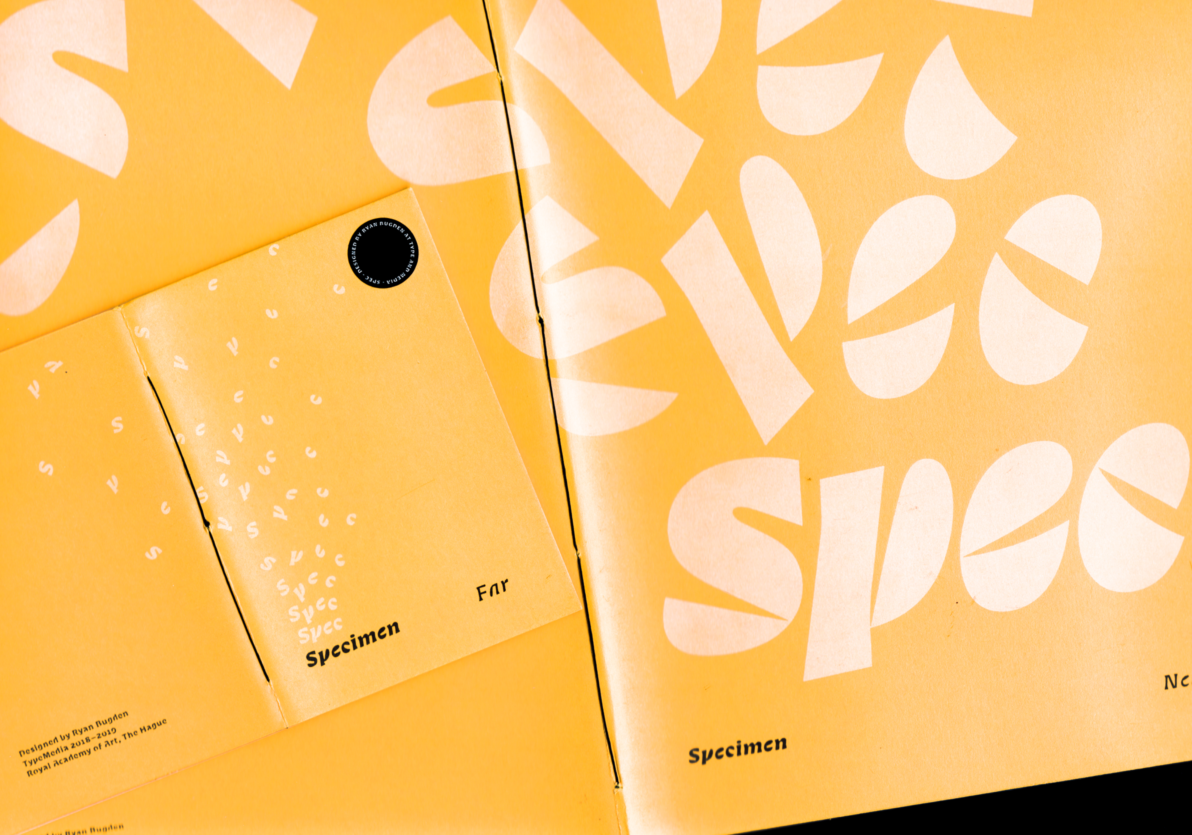
Spec
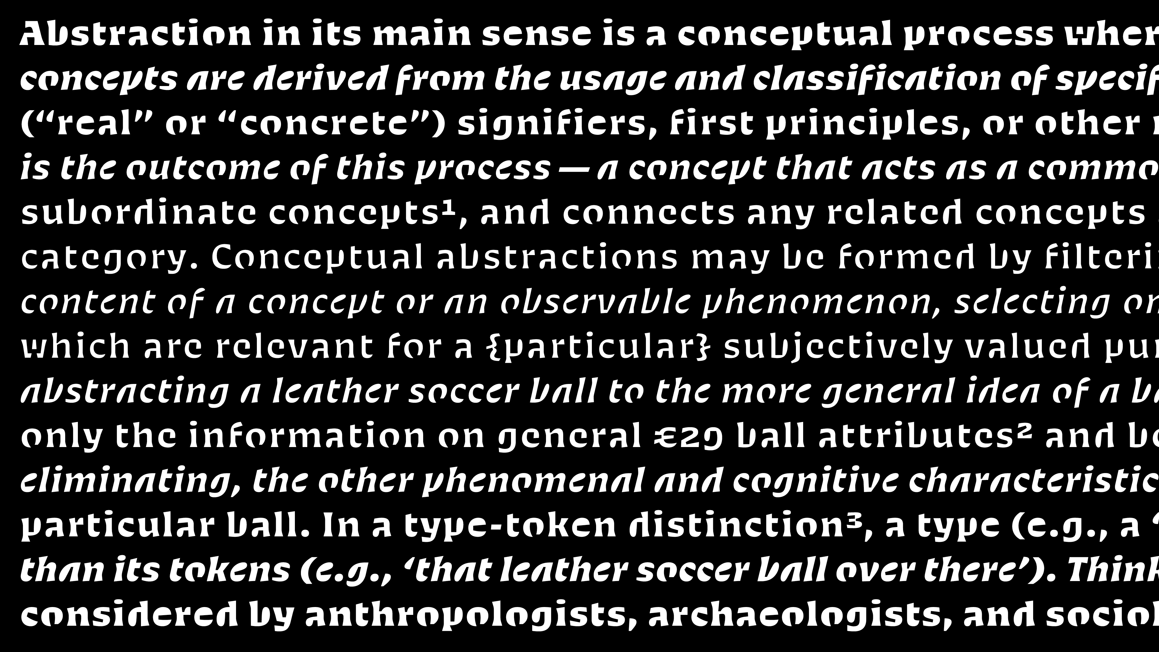
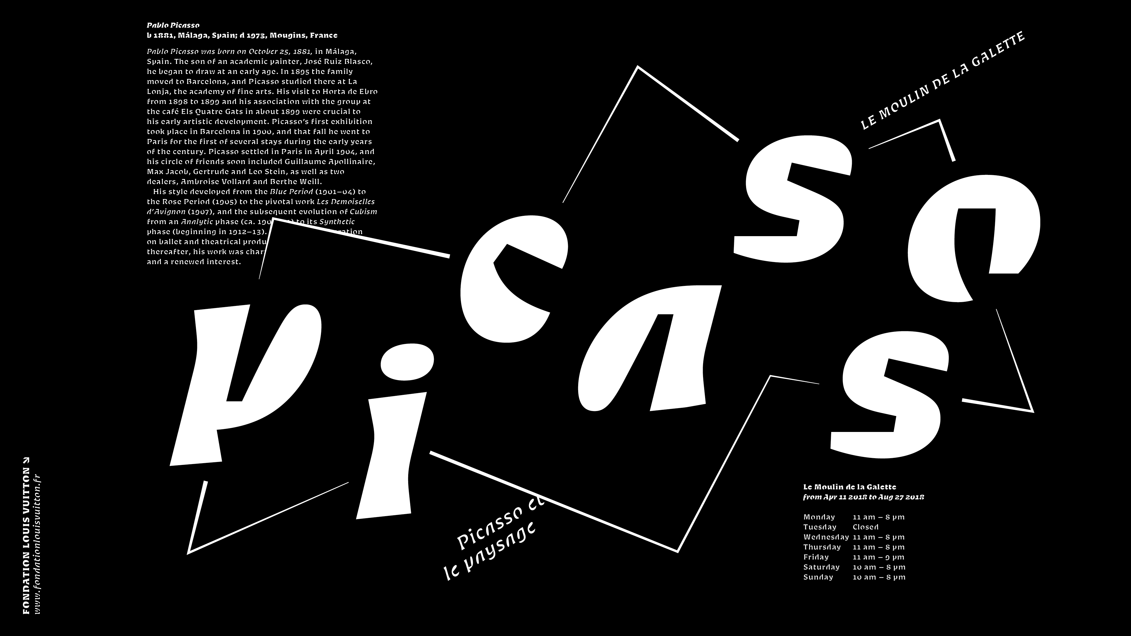
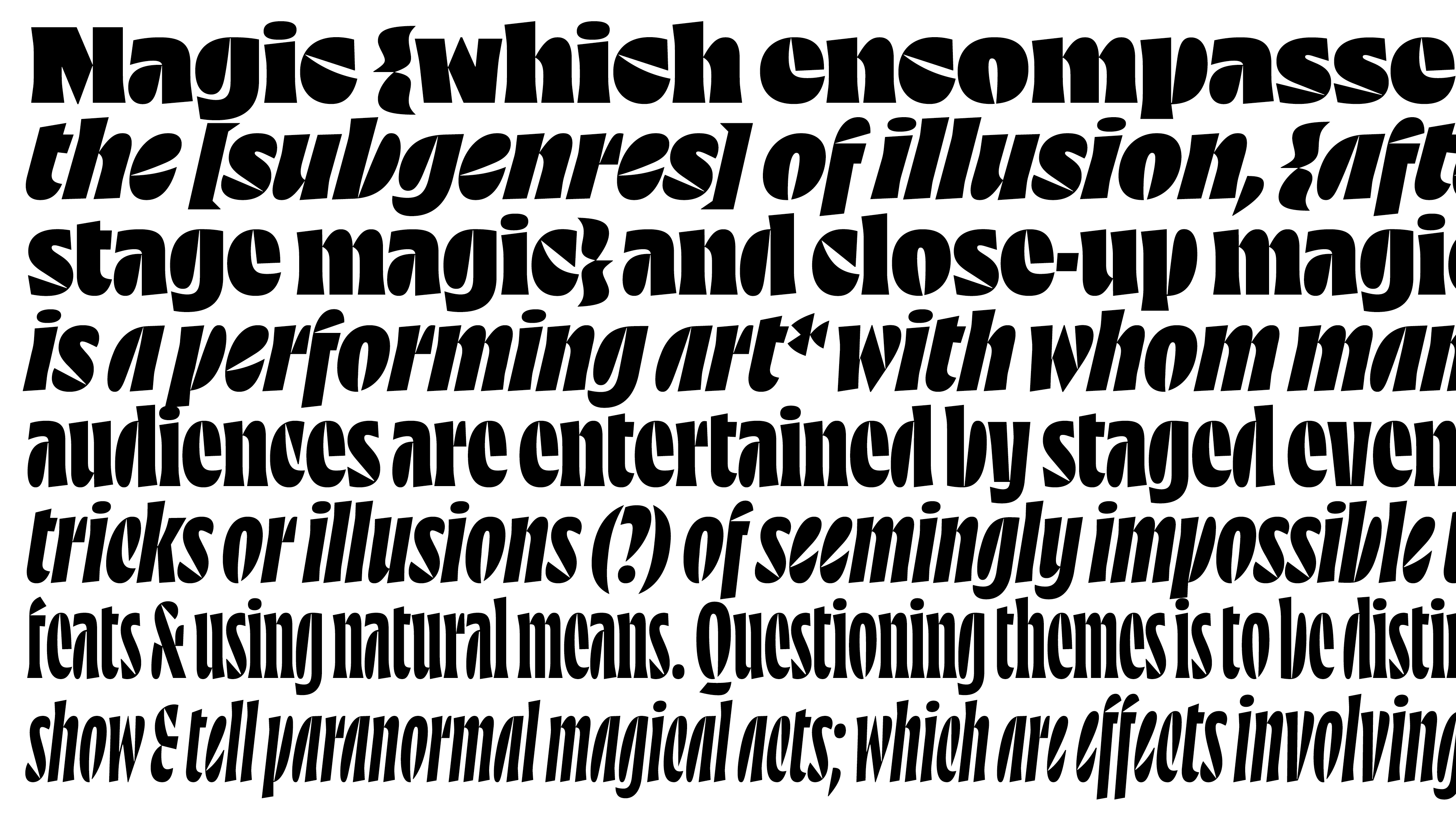
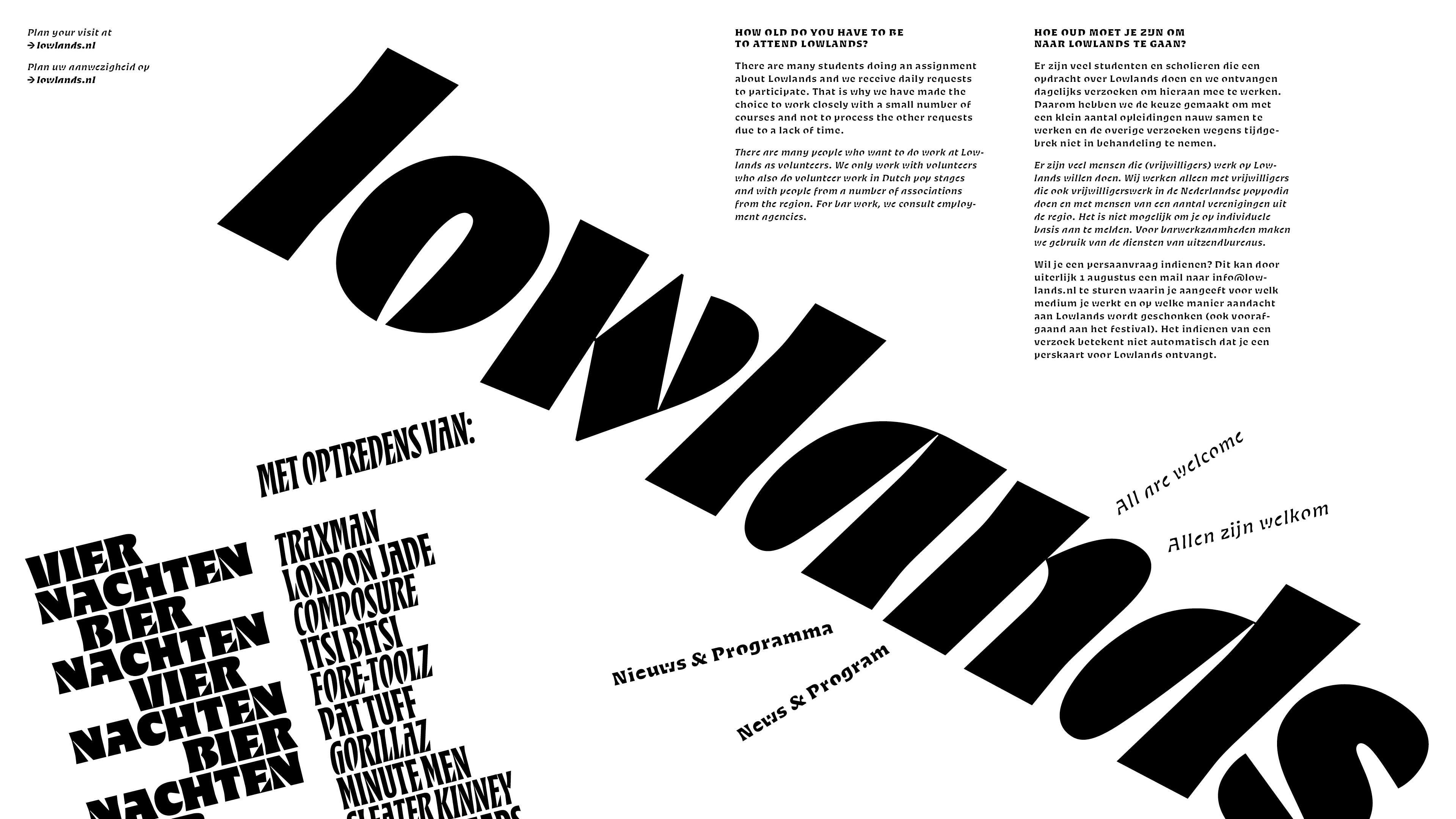
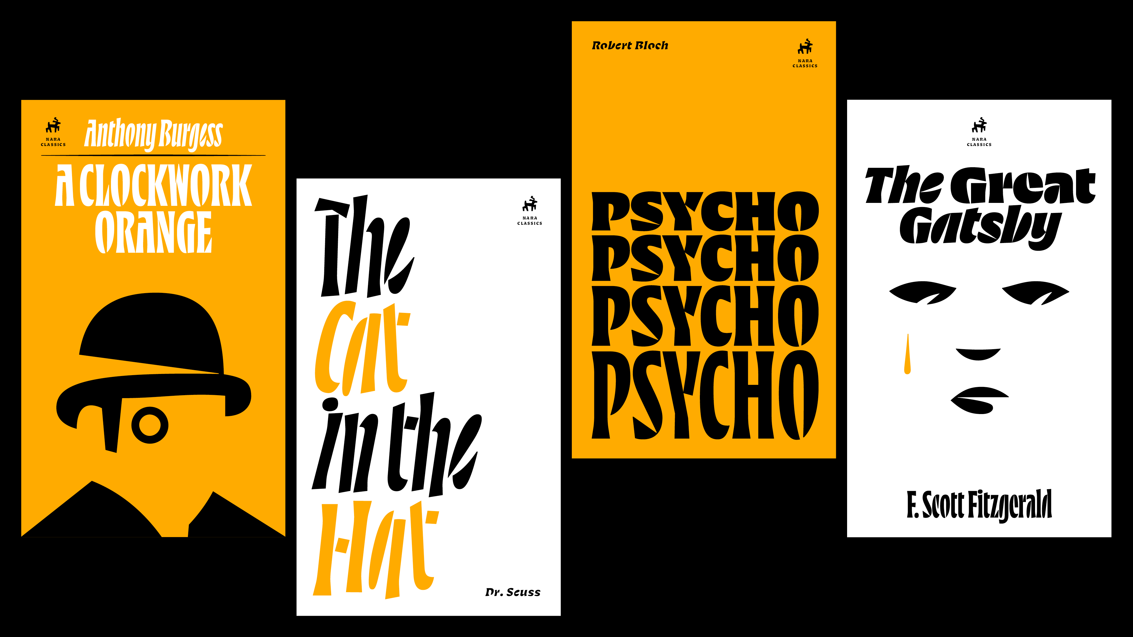
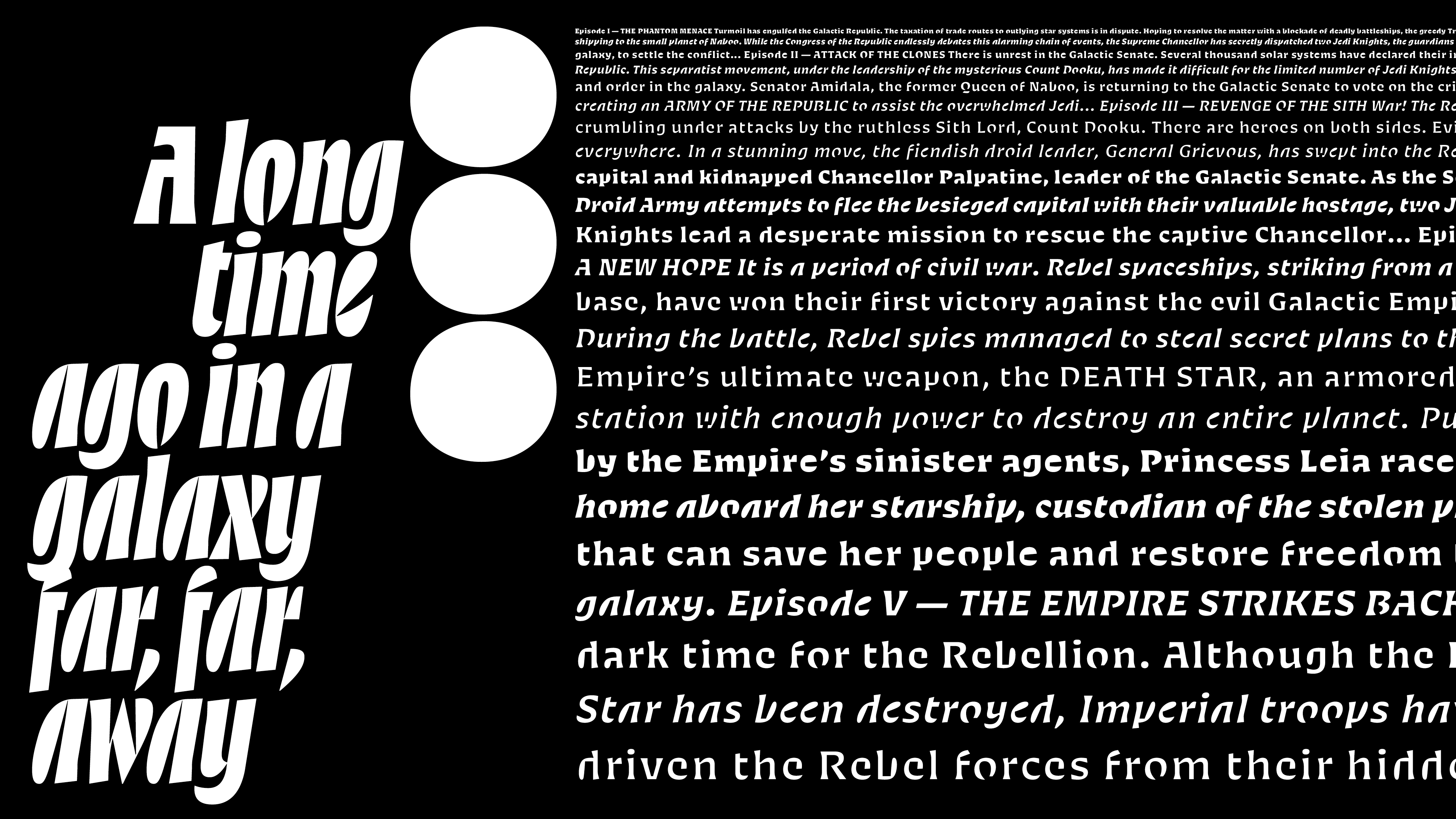
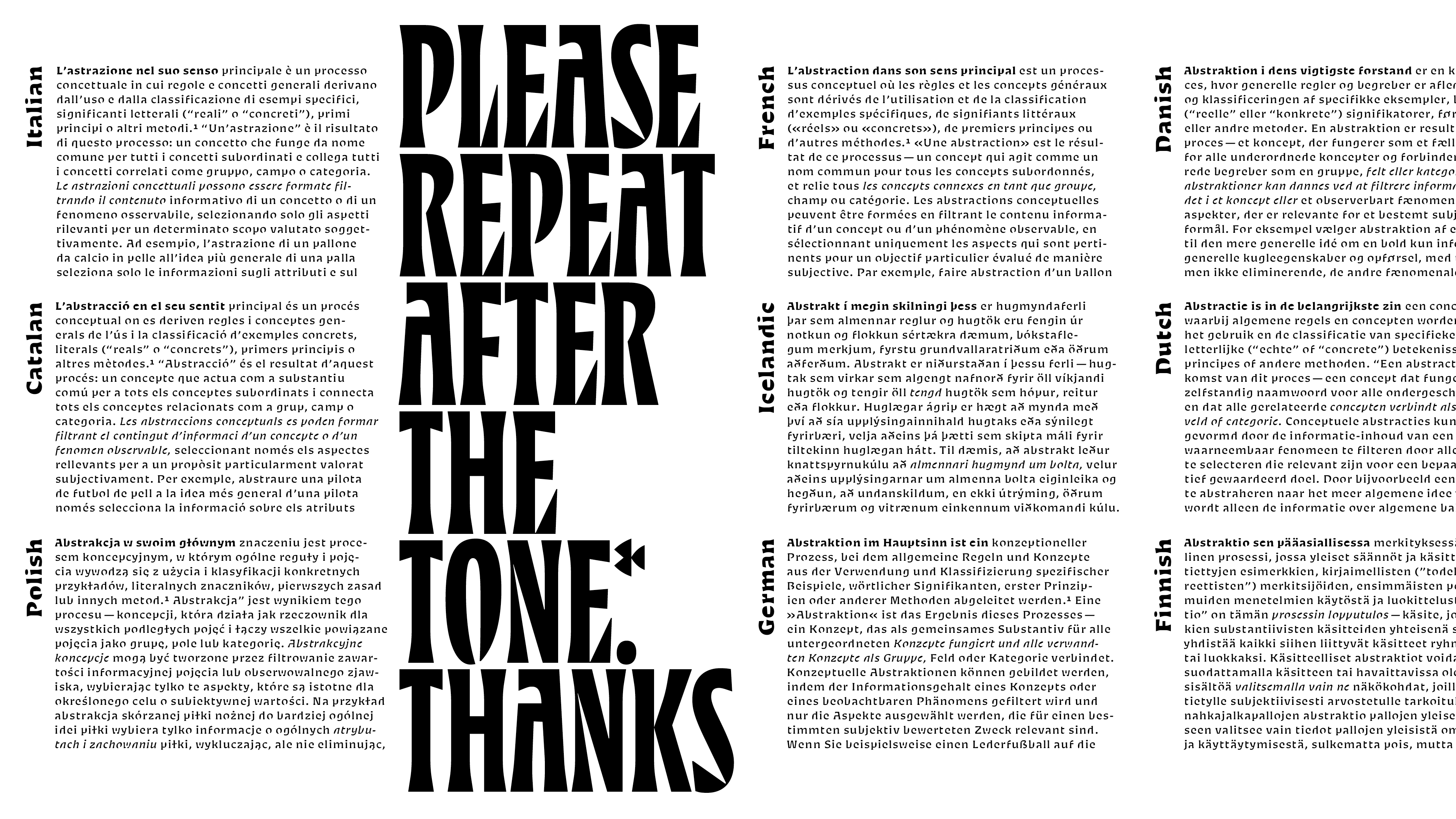
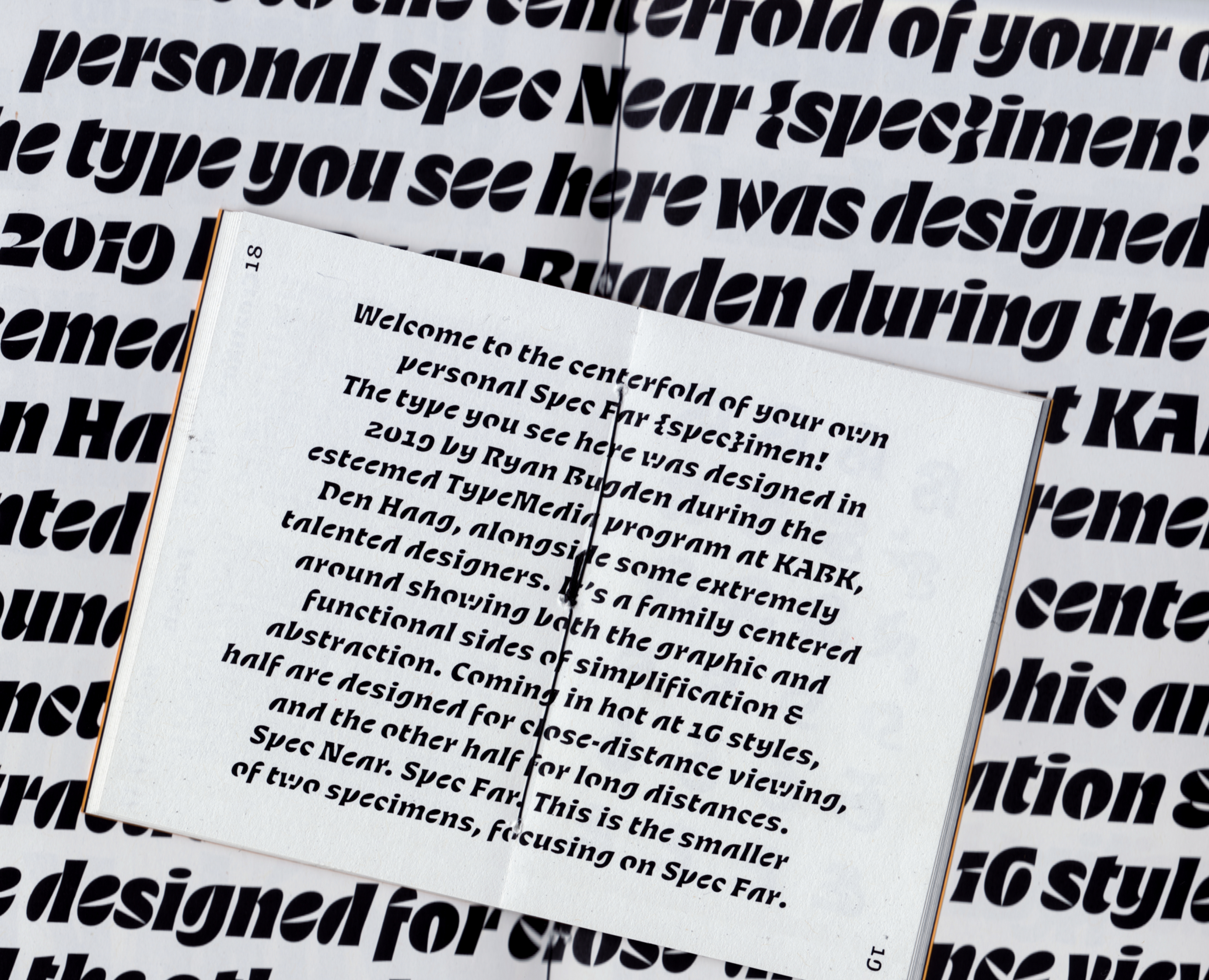
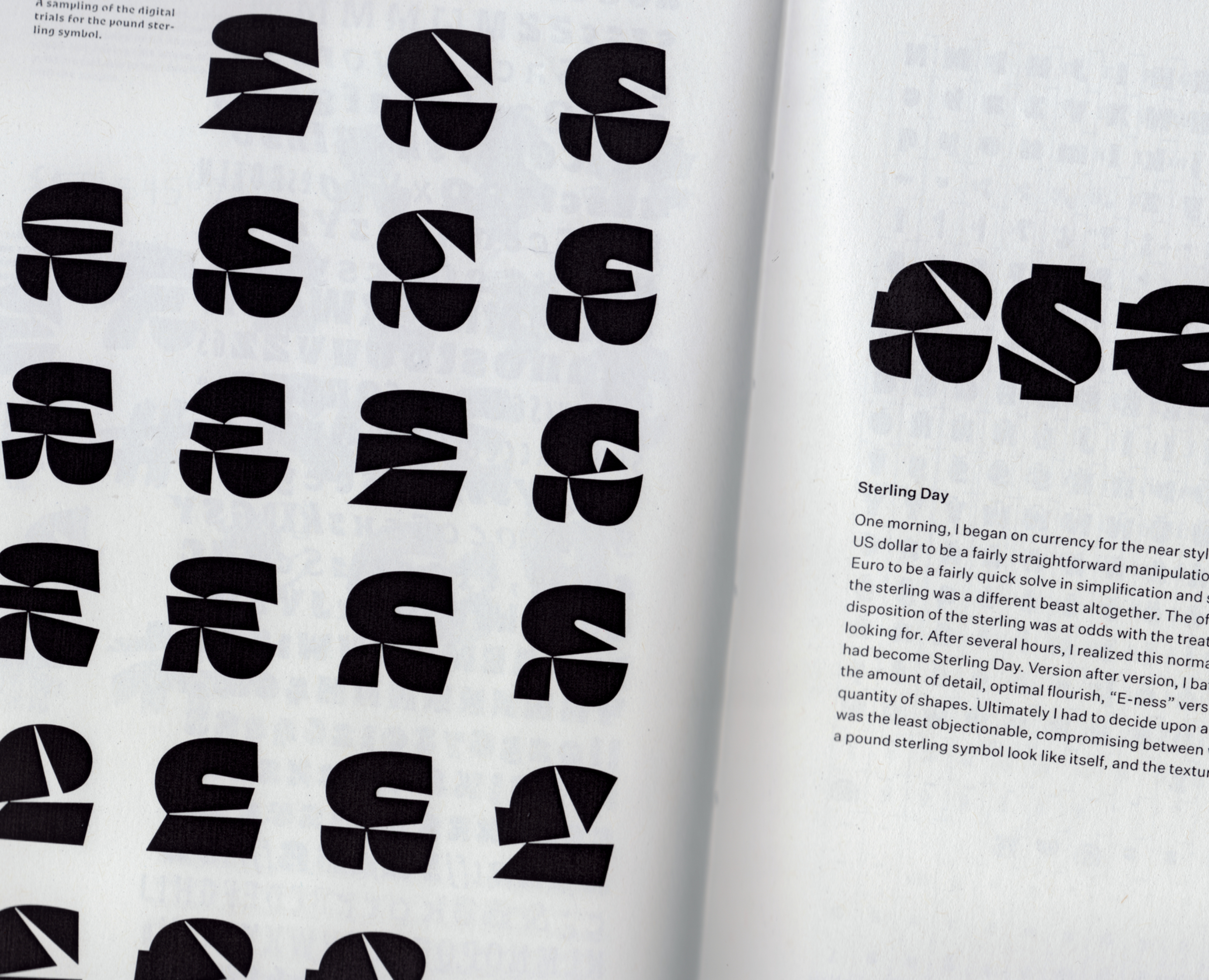
Spec shows both the graphic and functional sides of abstraction. Half of the family is designed for up-close viewing, and the other half is for long-distance: Spec Near and Spec Far. Near compresses the alphabet, simplifying shapes and crunching letter-widths. Far interprets the same shapes in a cruder manner, ruthlessly prying negative spaces open and filling closed forms. Across the whole family, Spec lets the reader’s mind do some of the work.
It was awarded a Certificate of Typographic Excellence from the Type Directors Club in 2020.
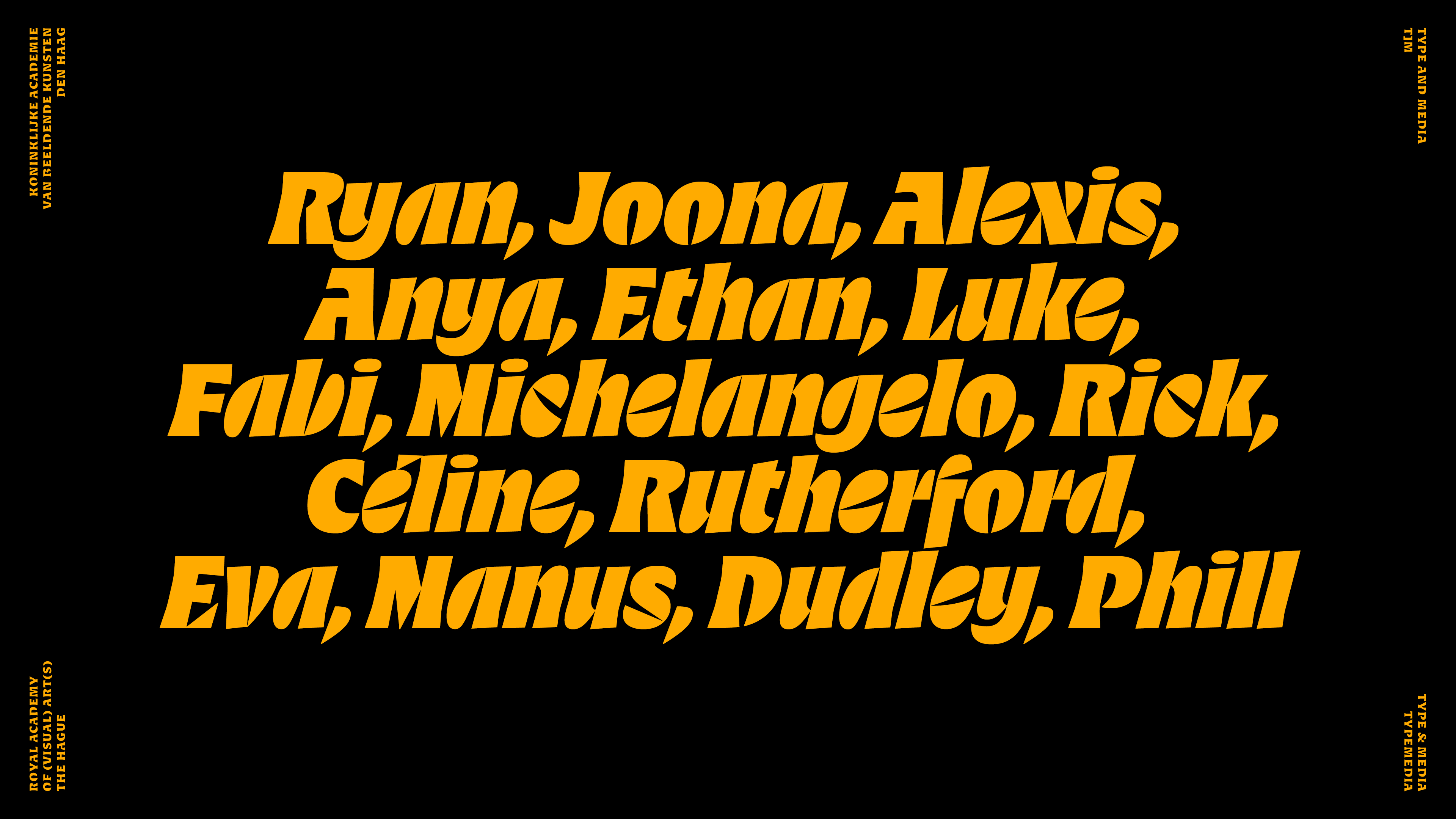
Spec is my graduation project from the Master TypeMedia program at the Royal Academy of Art in the Hague. See all of our projects together here.
| Instructors: | Erik van Blokland, Peter Verheul, Paul van der Laan, Peter Biľak, Françoise Berserik, Frank Grießhammer, Fred Smeijers, Just van Rossum, Petr van Blokland |
Please contact me if you would like to inquire about purchasing a license.