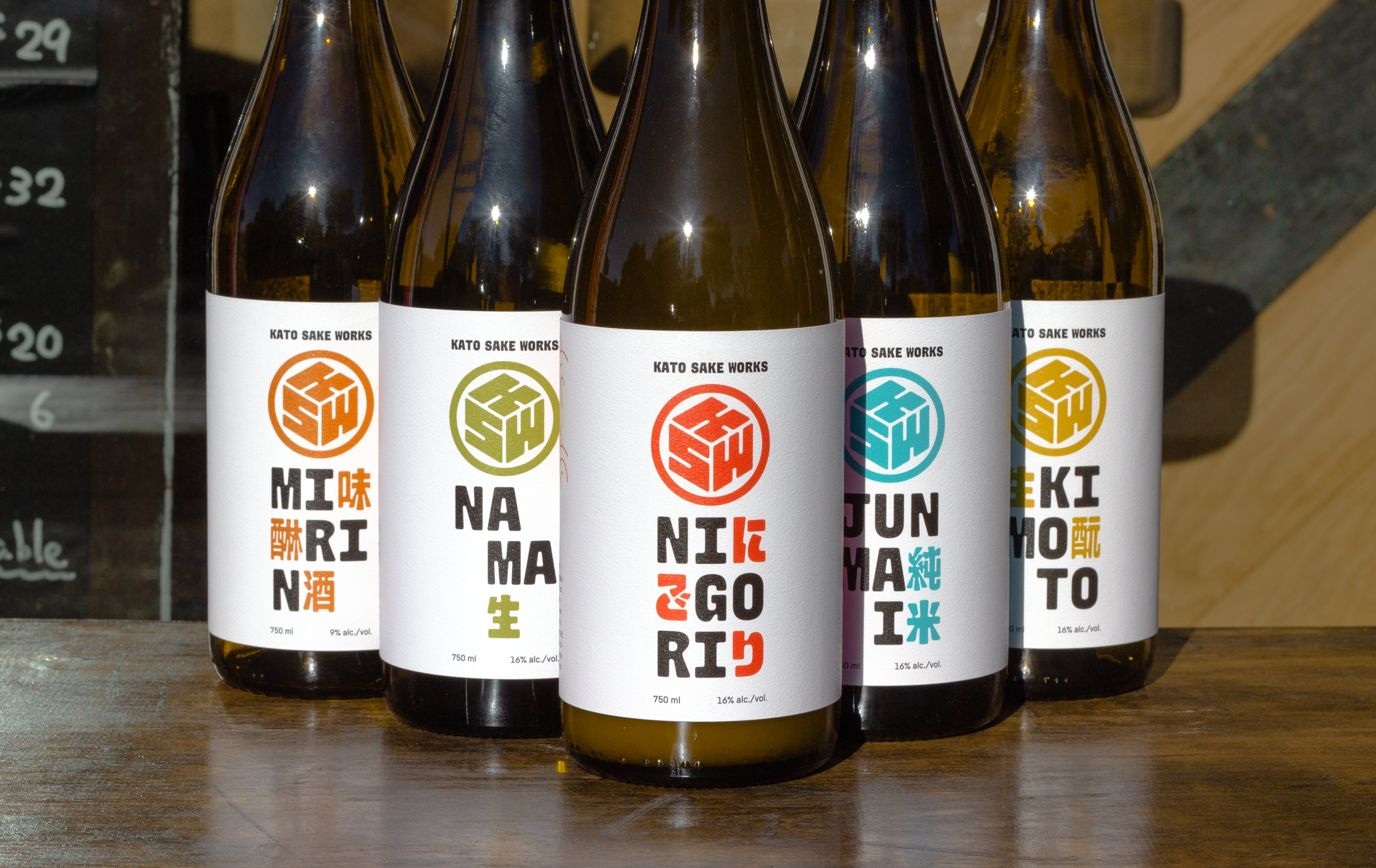
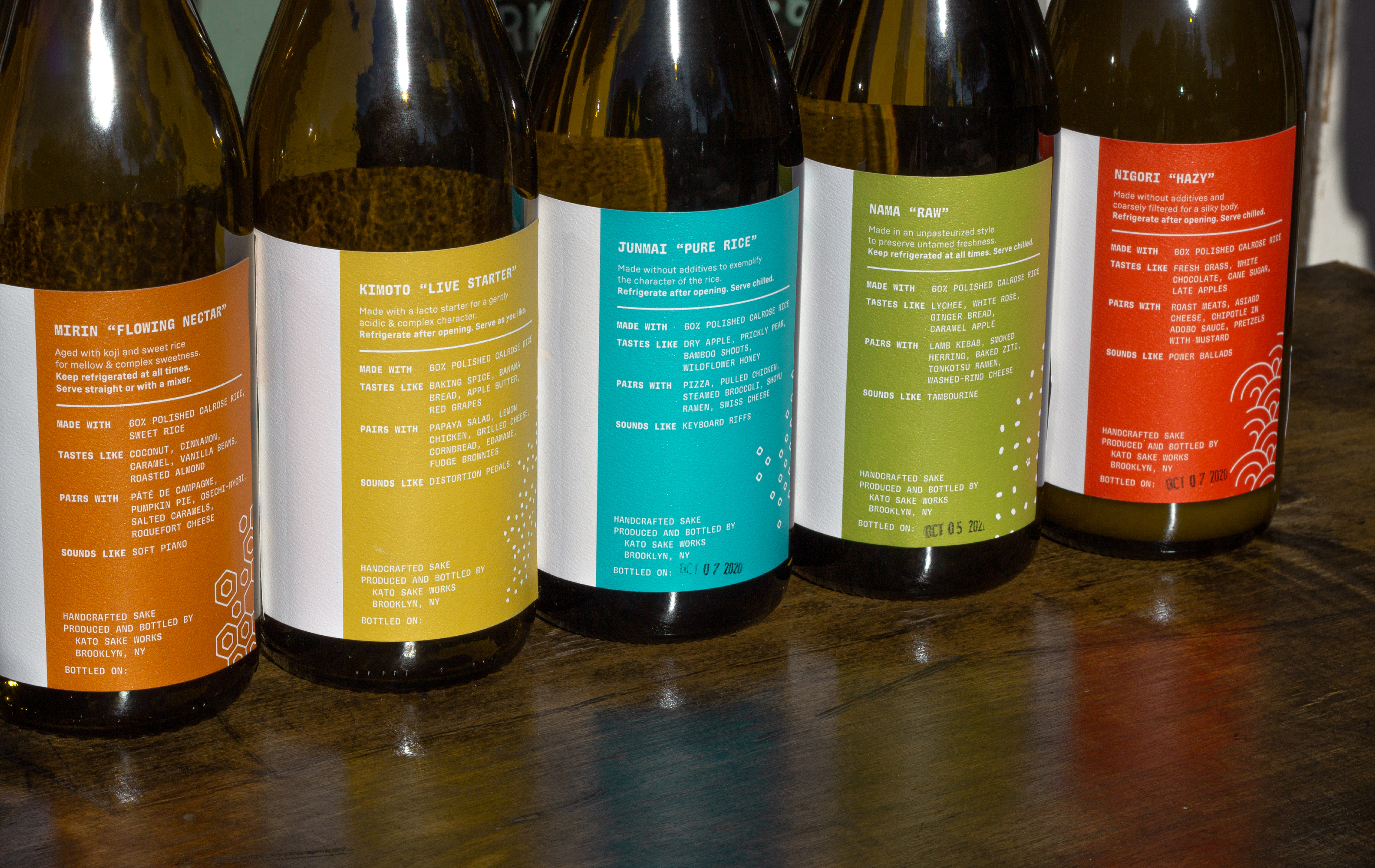
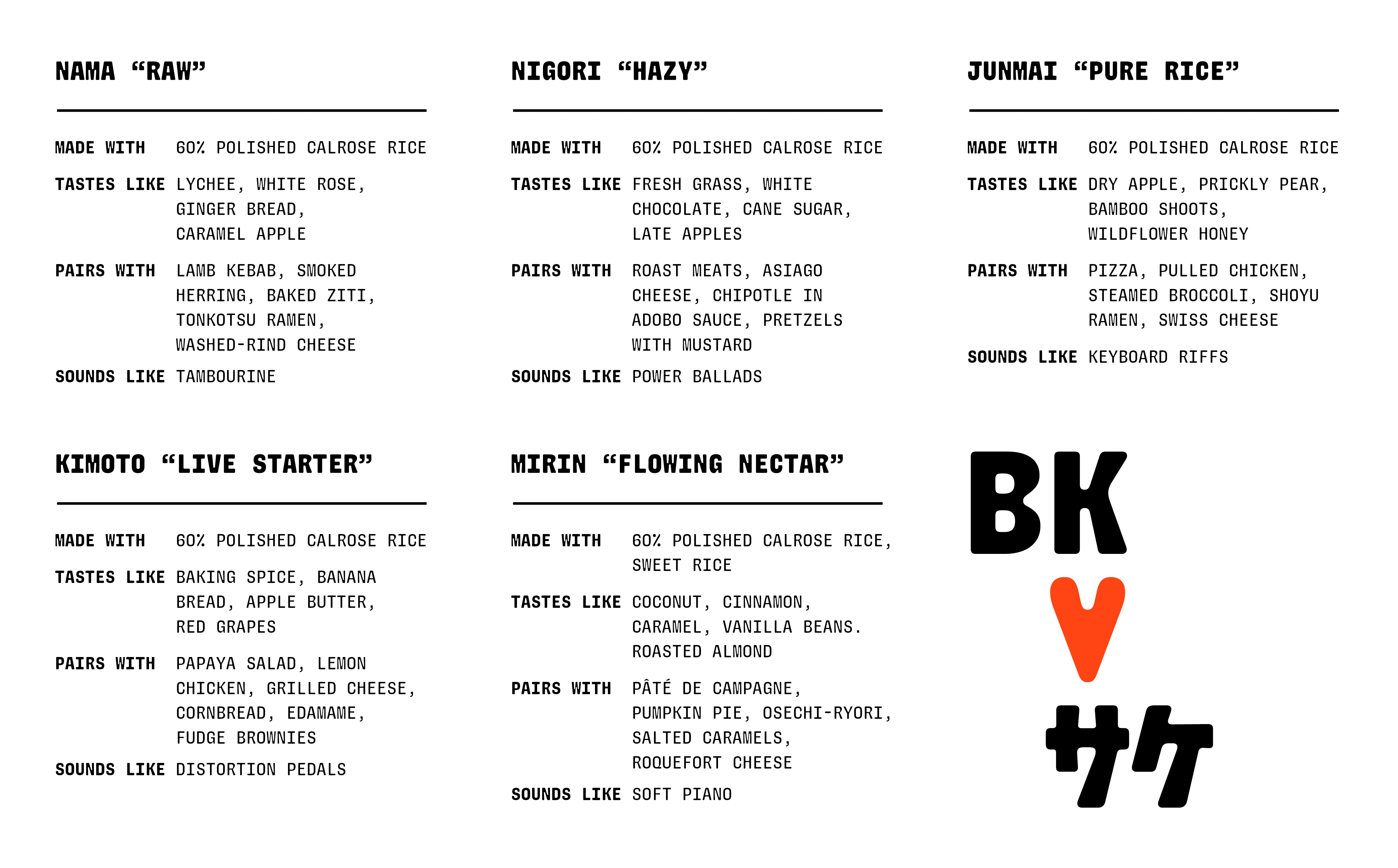
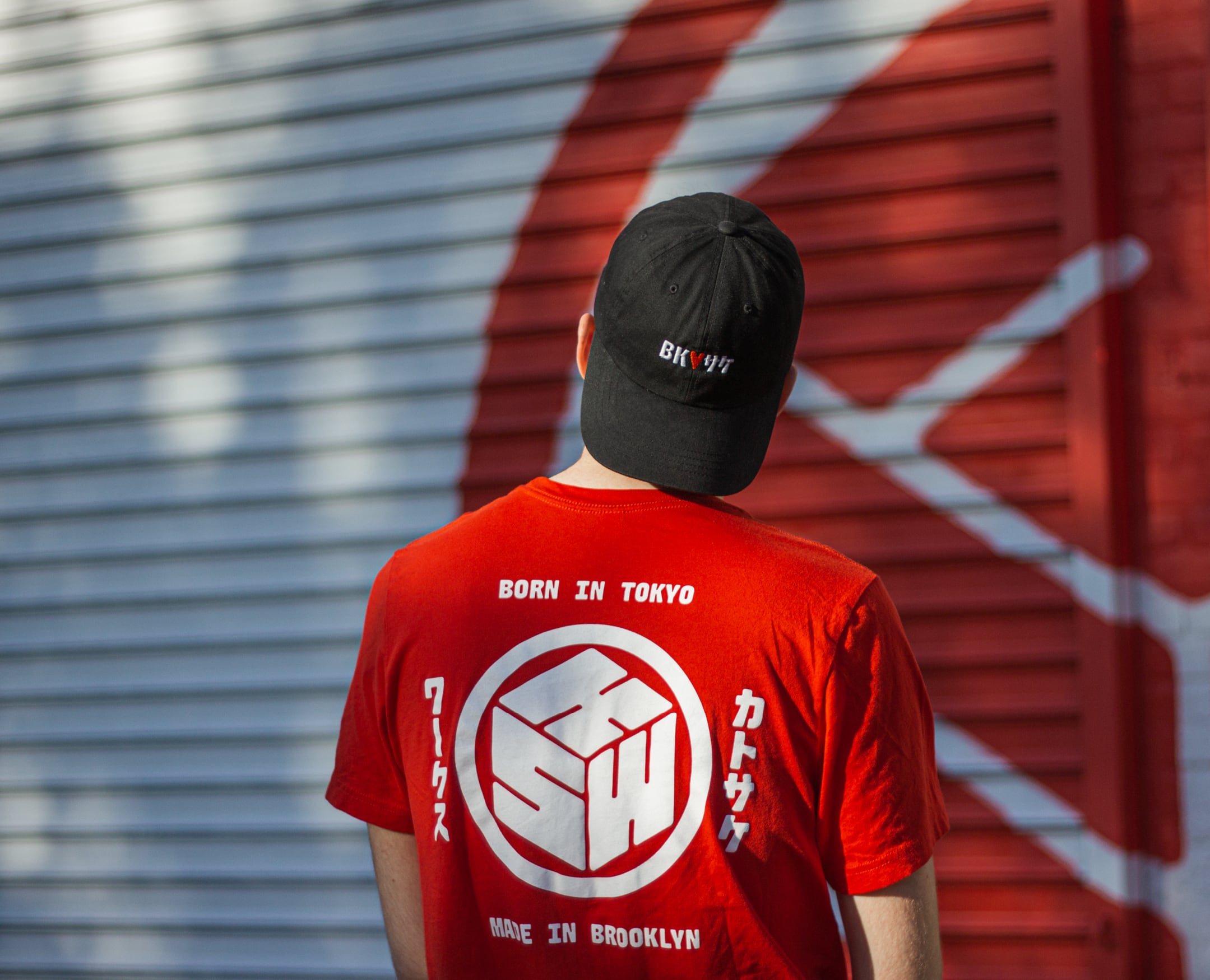
Kato Sake Works
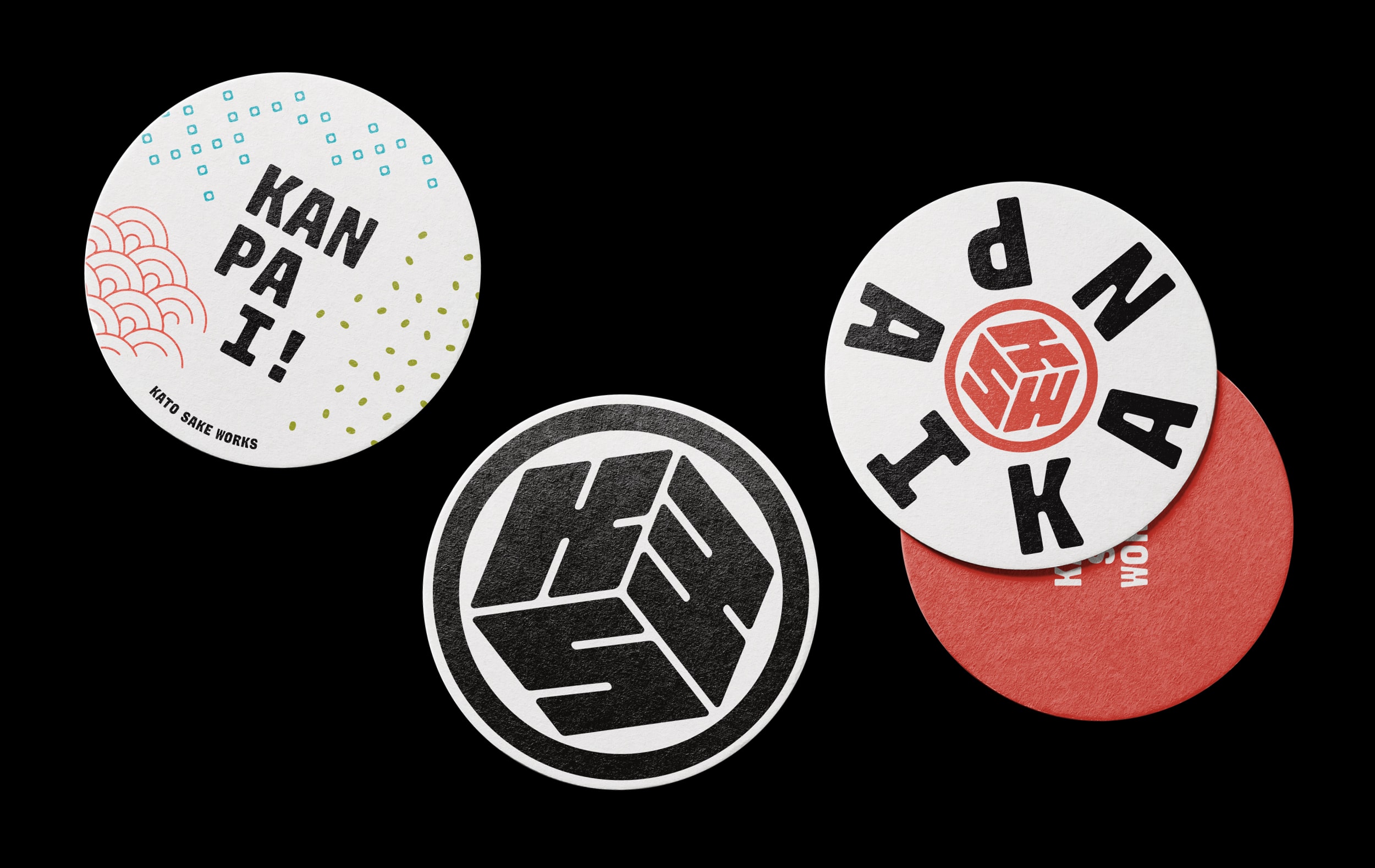
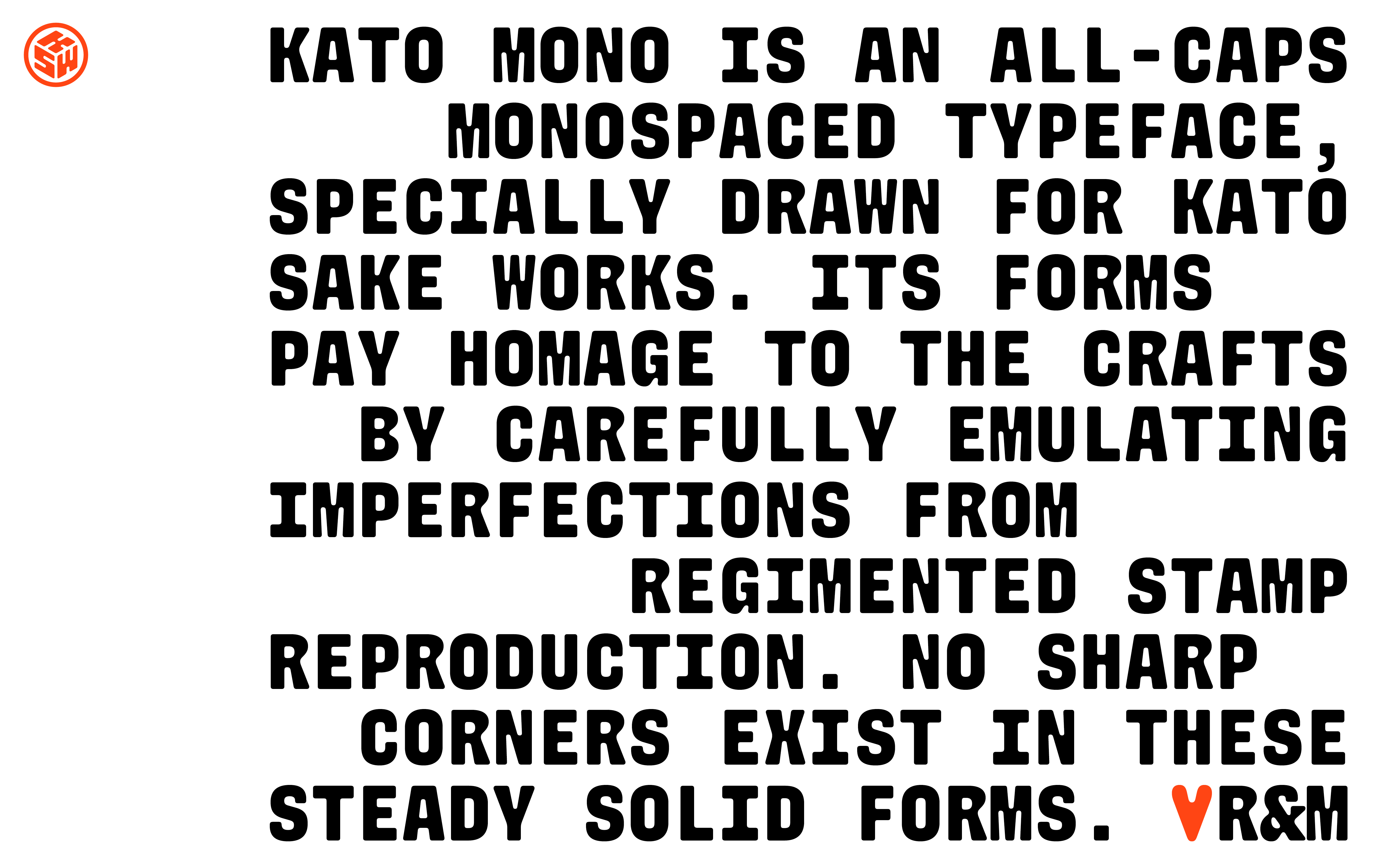
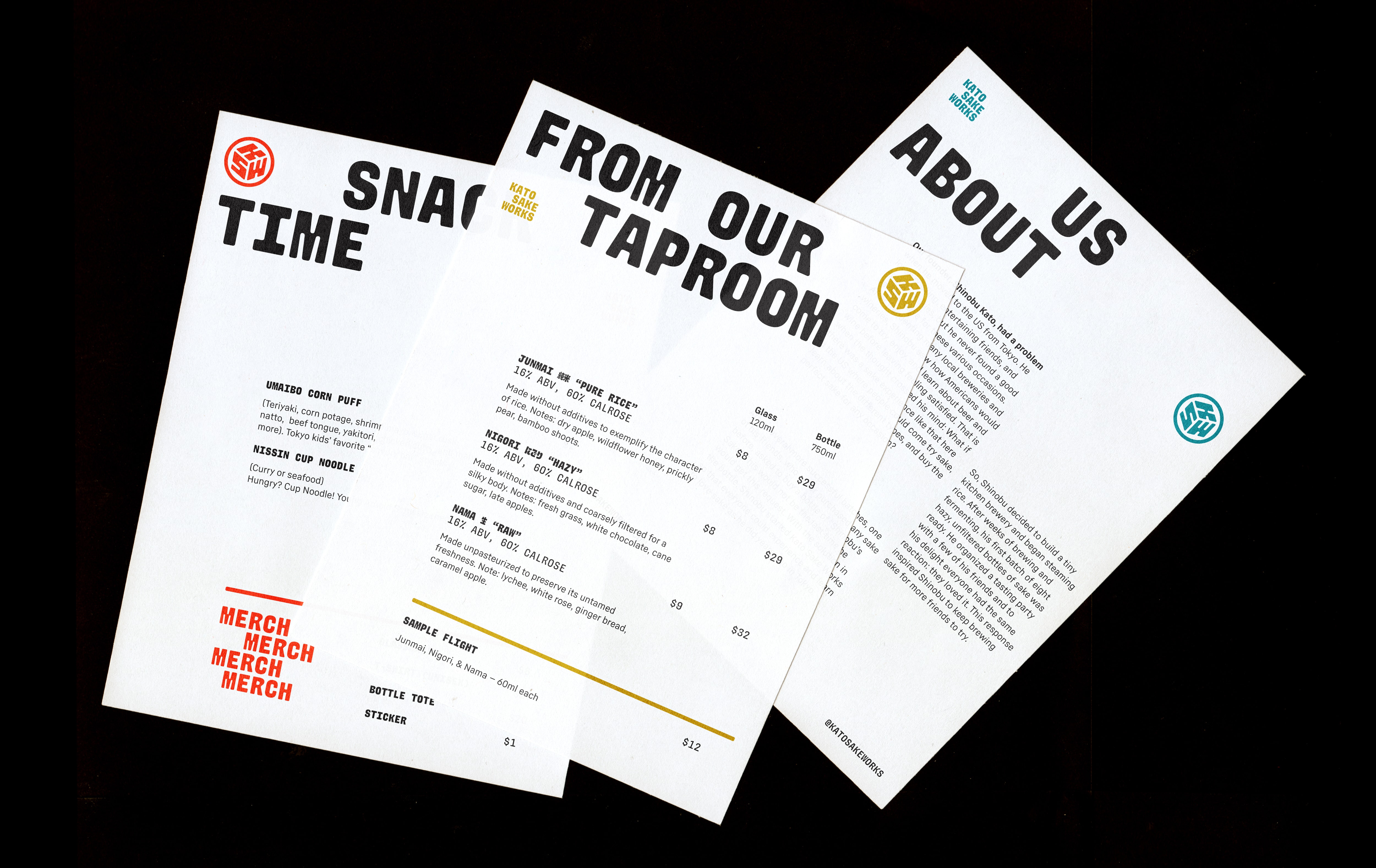
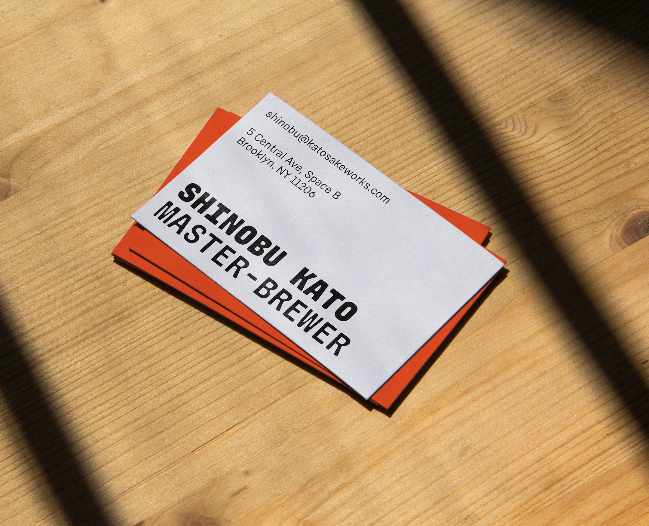
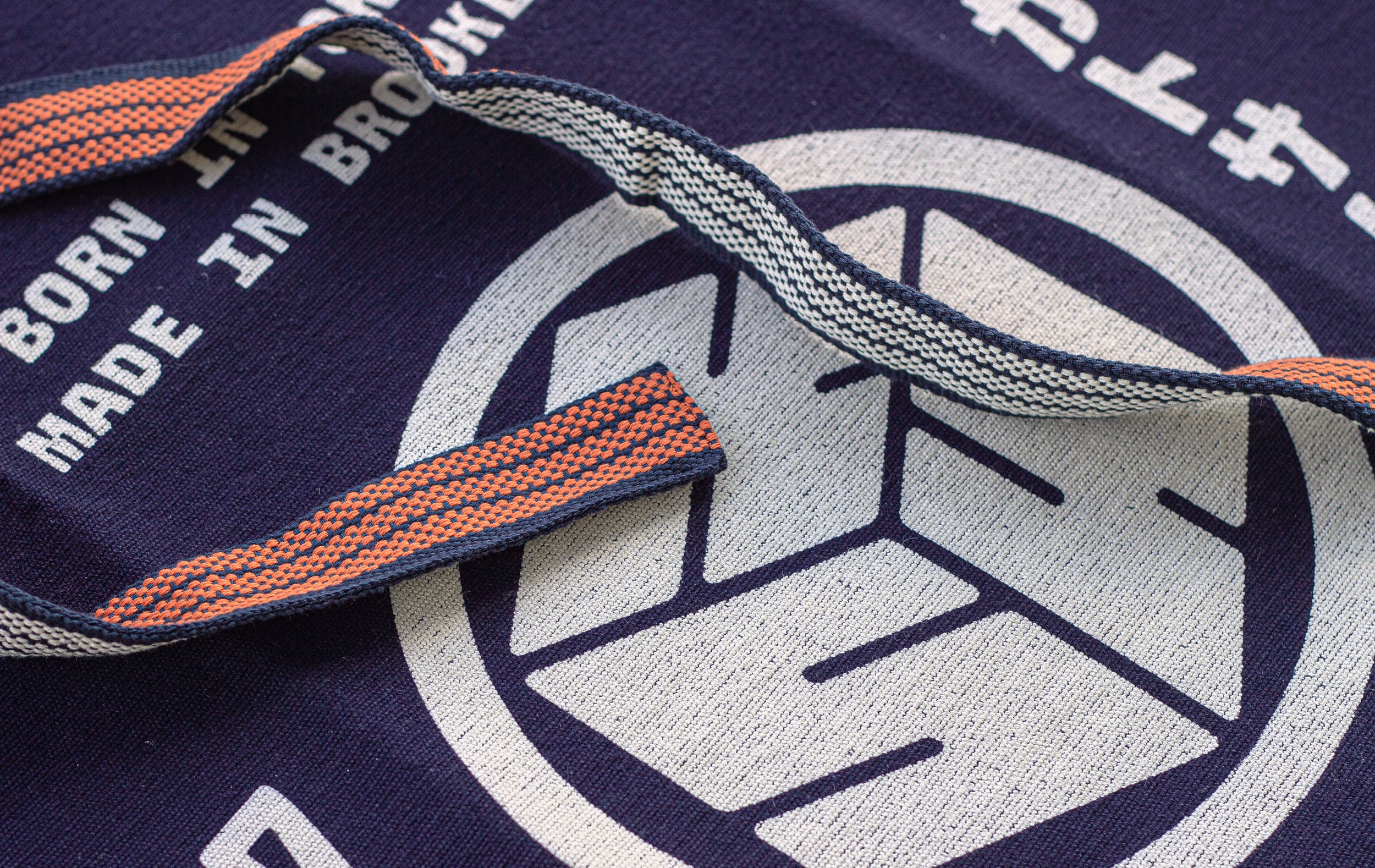
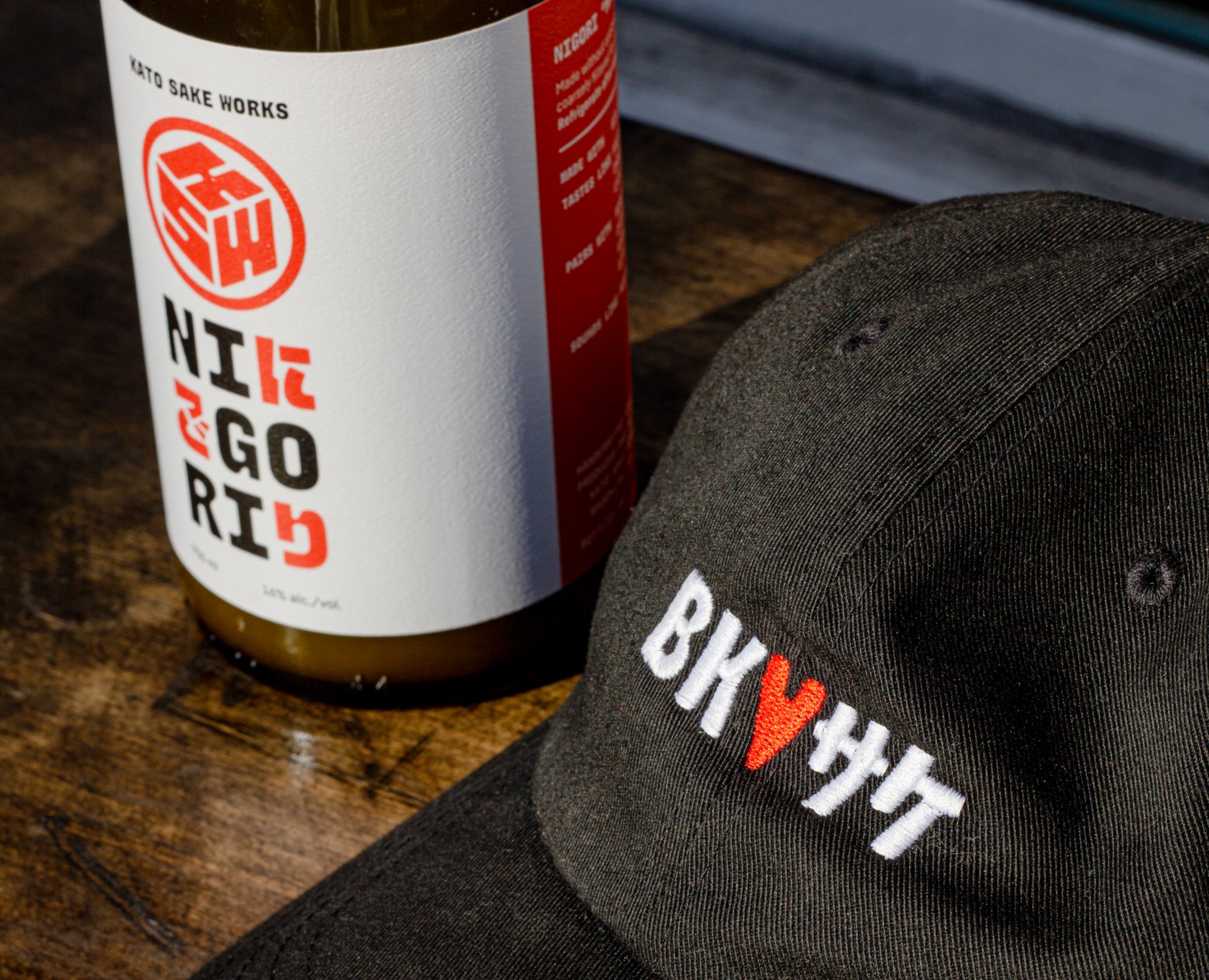
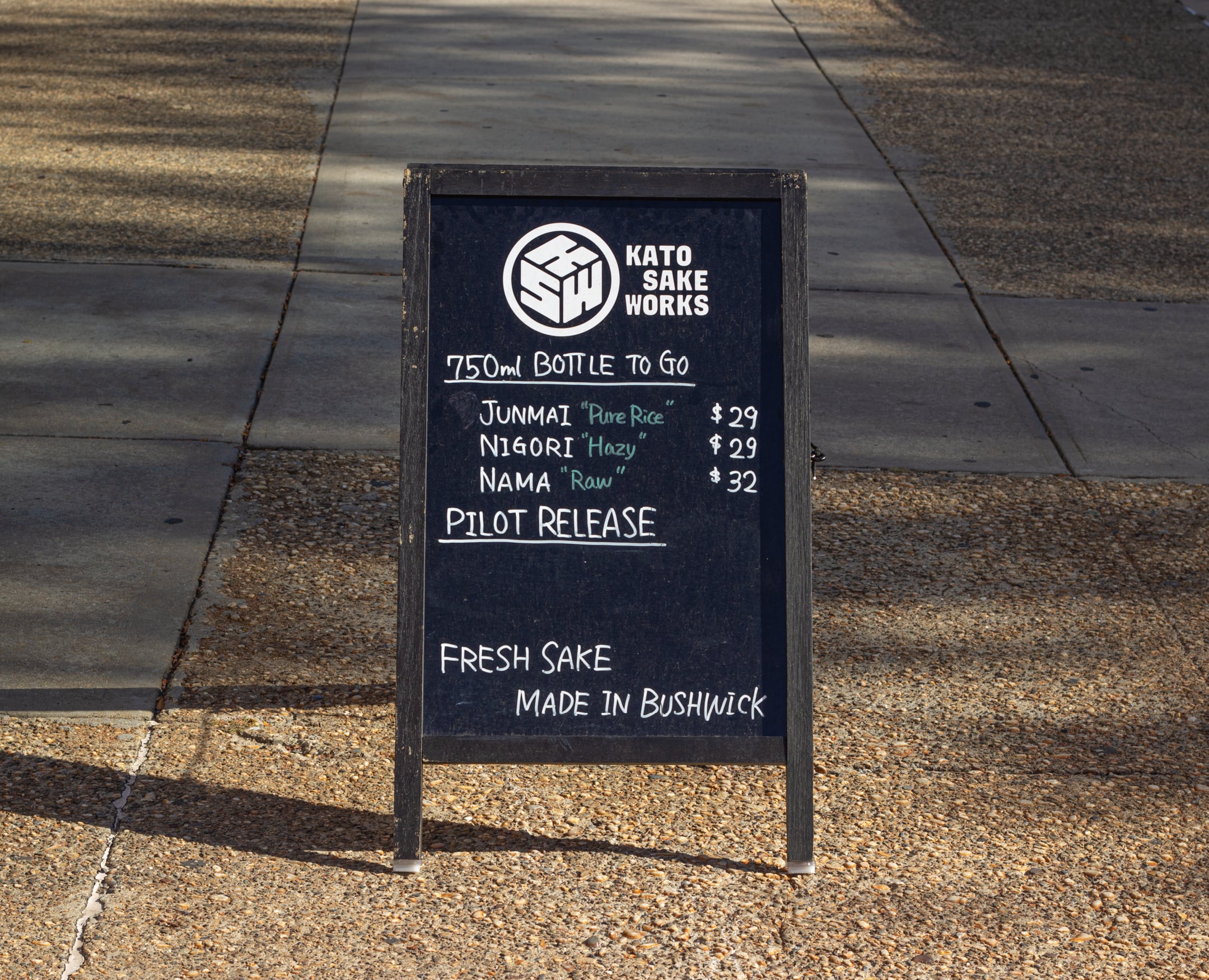
Kato Sake Works is a local sake brewery in Bushwick, Brooklyn run by Shinobu Kato. We connected with him to design KSW’s brand identity and sake bottle packaging system. The logo is a modernization of a Japanese “mon” and was made in a range of optical sizes. The finish of the logo and the accompanying wordmark is meant to carry forward the feeling of “craft” sake. We expanded the wordmark into a five-weight type family, to allow KSW’s voice to extend beyond the logo.
Kato Sake Works is an R&M project.
| Design: | Ryan Bugden, Michelle Ando |
| Type design: | Ryan Bugden |
| Painting: | Frank Nathen |
| Illustration: | Tomi Um |